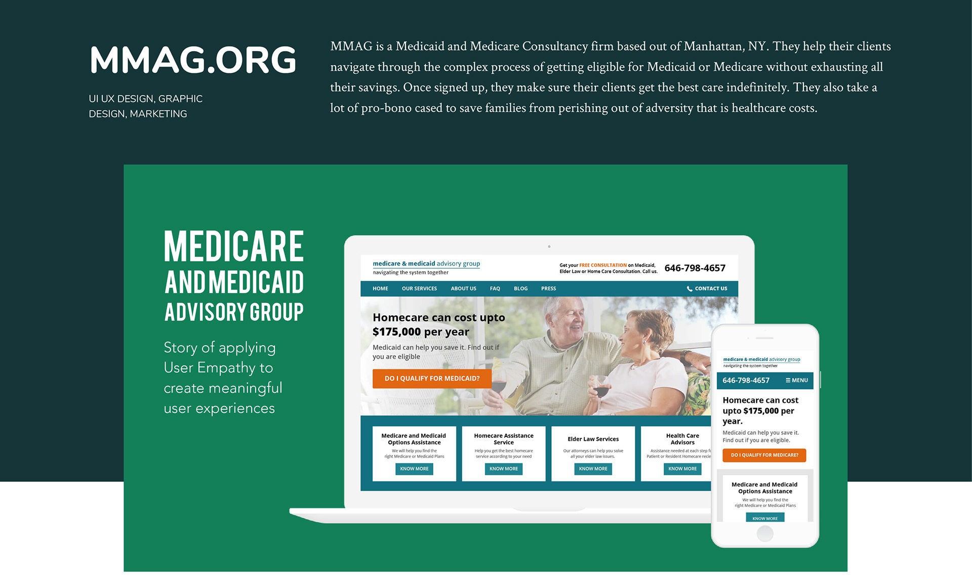

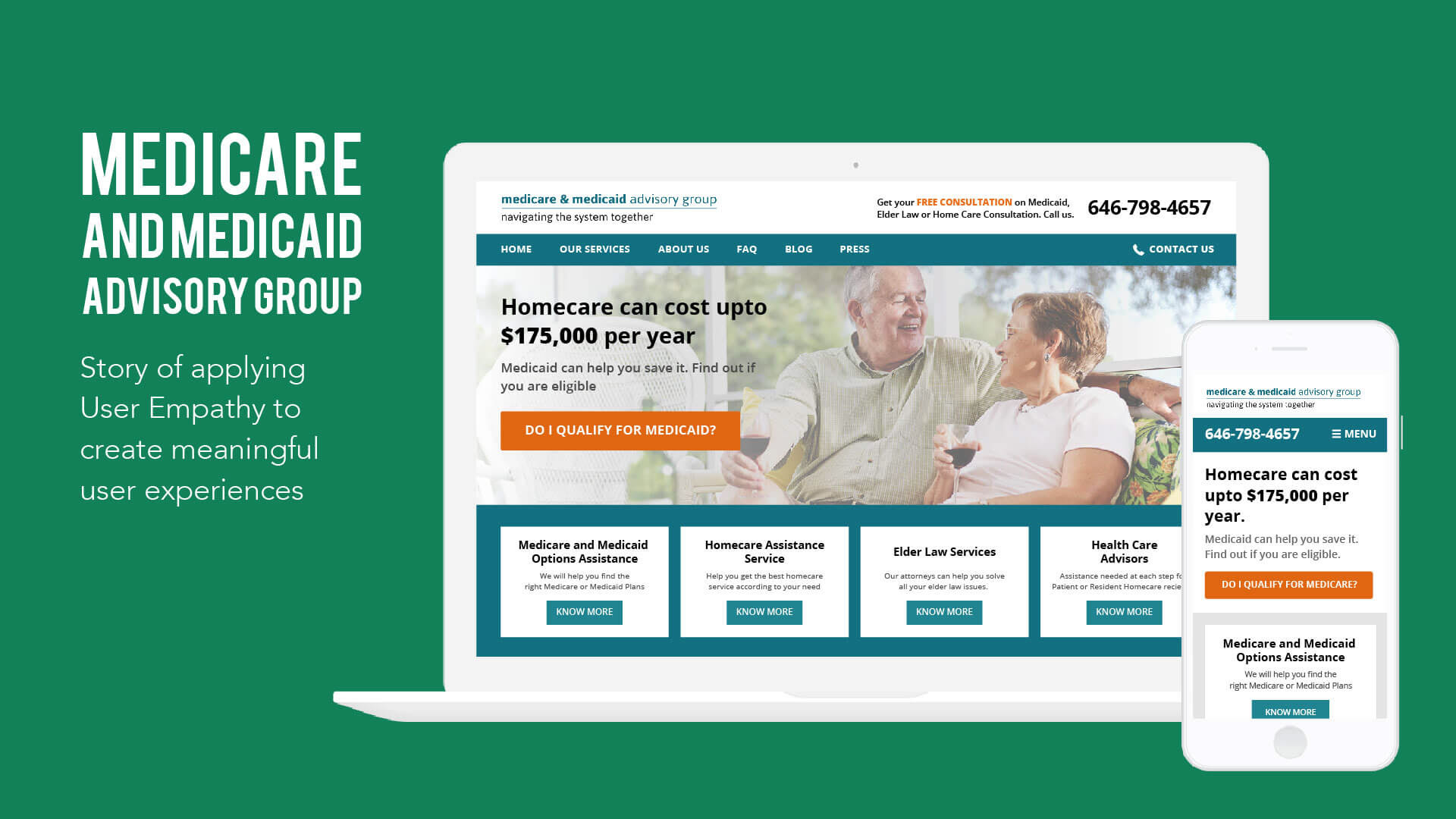
Crafting customer experience based on user empathy and extensive research
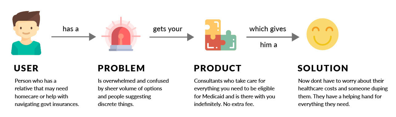
According to a study, 56 million Americans will be 65 and older by 2020. And nearly 70% of them will not be able to care for themselves at some point in their life. A country where 15% of the total population is over 65, medical costs have never been higher. It could cost upwards of $175,000 to provide full-time home care to an elder adult. Families lose all their money caring for their loved ones.
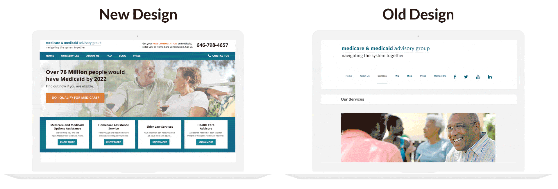
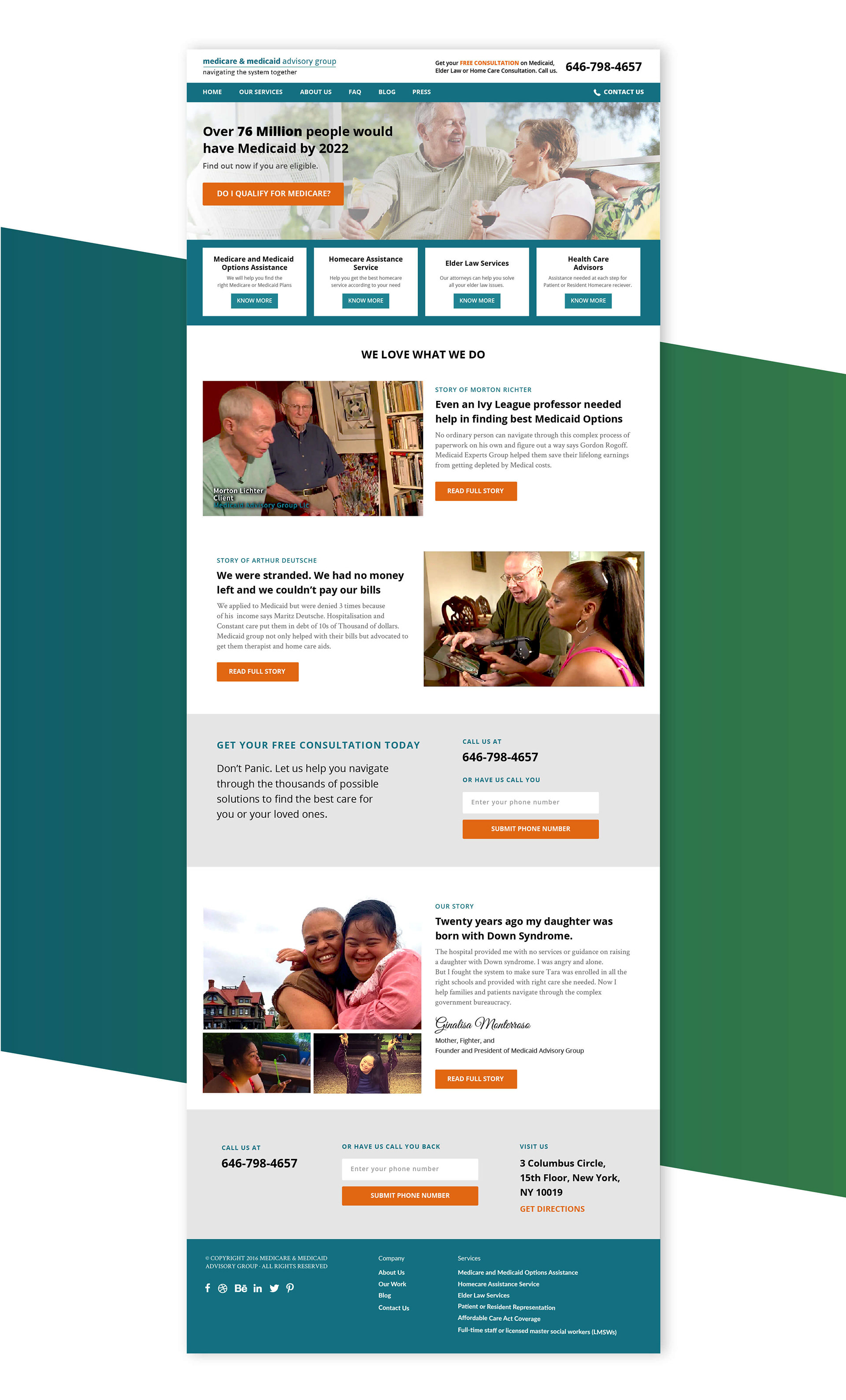
MMAG helps such families navigate through the complex process of getting eligible for Medicaid and Medicare. Without a professional help, these government insurance are a nightmare even for a Yale Professor. When MMAG’s Ginalisa first got in touch with us, they had recently gone through a website redesign and were spending around $1500 each month on Adwords.
They were paying to send traffic to the homepage of their website that they were not entirely confident about. We knew instantly that problem was not with the ad campaign or the website (at least not just that). Problem was that they didn’t have a proper funnel and digital strategy of attracting, closing and helping people who are looking for their help.
We planned to go to their office based in New York and work with the team for a week to figure out the best digital strategy for the business.We started off with meeting their clients and prospects.

We quickly realised a pattern. Most of the customers had few common friction points:
Trust Issues: The stress of finding the best care for the loved ones and entire saving being on the risk or perishing made the clients take decisions.
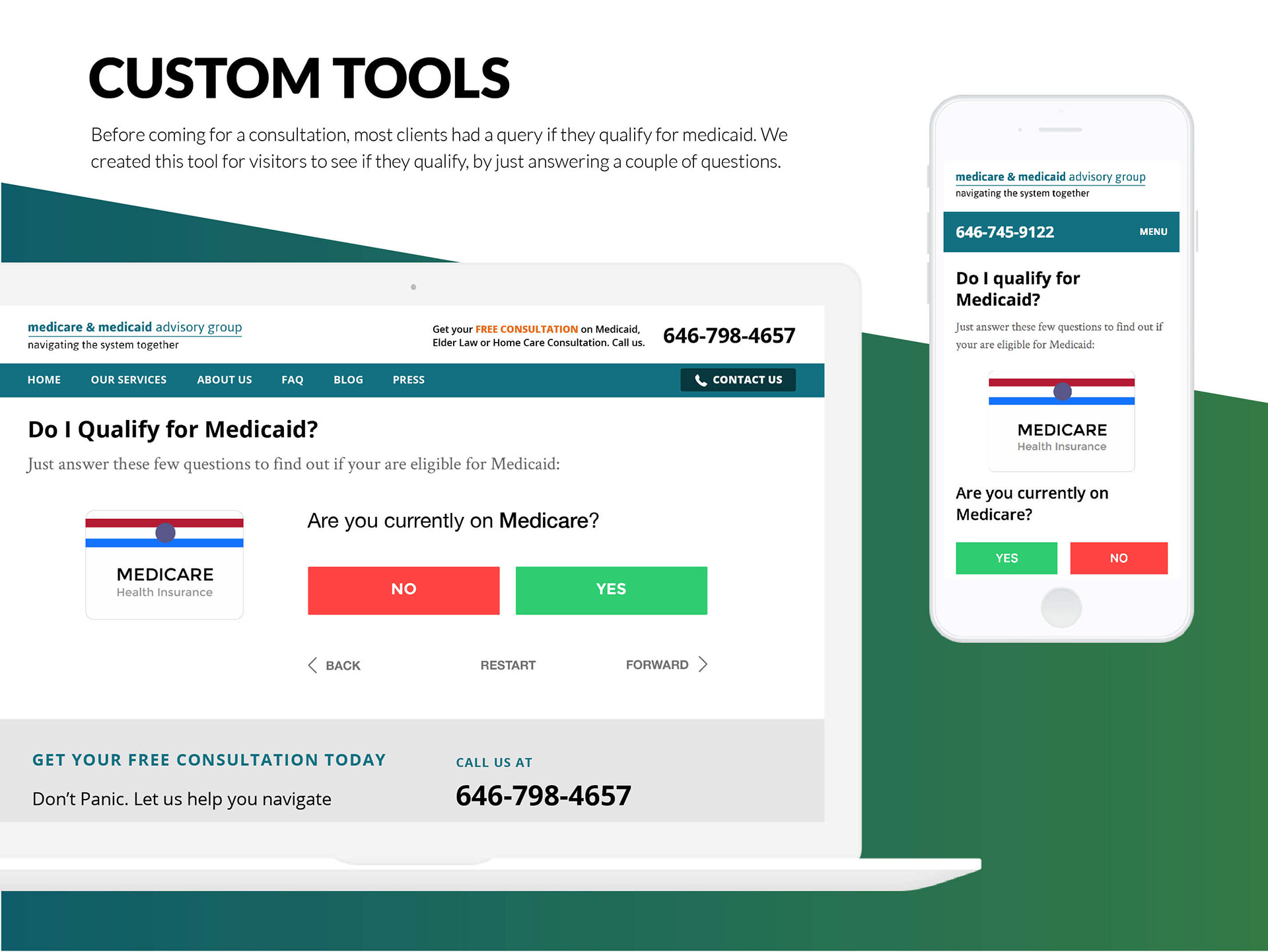
Not sure if they qualify: Most clients think that to be eligible for Medicaid you need to be poor. But there rather legal ways to make one eligible for Medicaid without breaking into their savings.
Thought that every professional in the industry is there for money: It resonates with the trust issues, but most of them thought that every professional in the industry is in it just for money and don’t really care for client’s welfare.
We decided to tackle all these issues in our overall digital strategy.
FRAMEWORK USED
We decided to use our own framework, “Pirates of Product” to revamp MMAG’s website and create a much better experience. As there was no user research or data analysis documentation from the previous designers of the website, we decided to take this from the scratch. Deadman’s Island is the section of our framework which guides you through the ideal steps of a design from scratch.
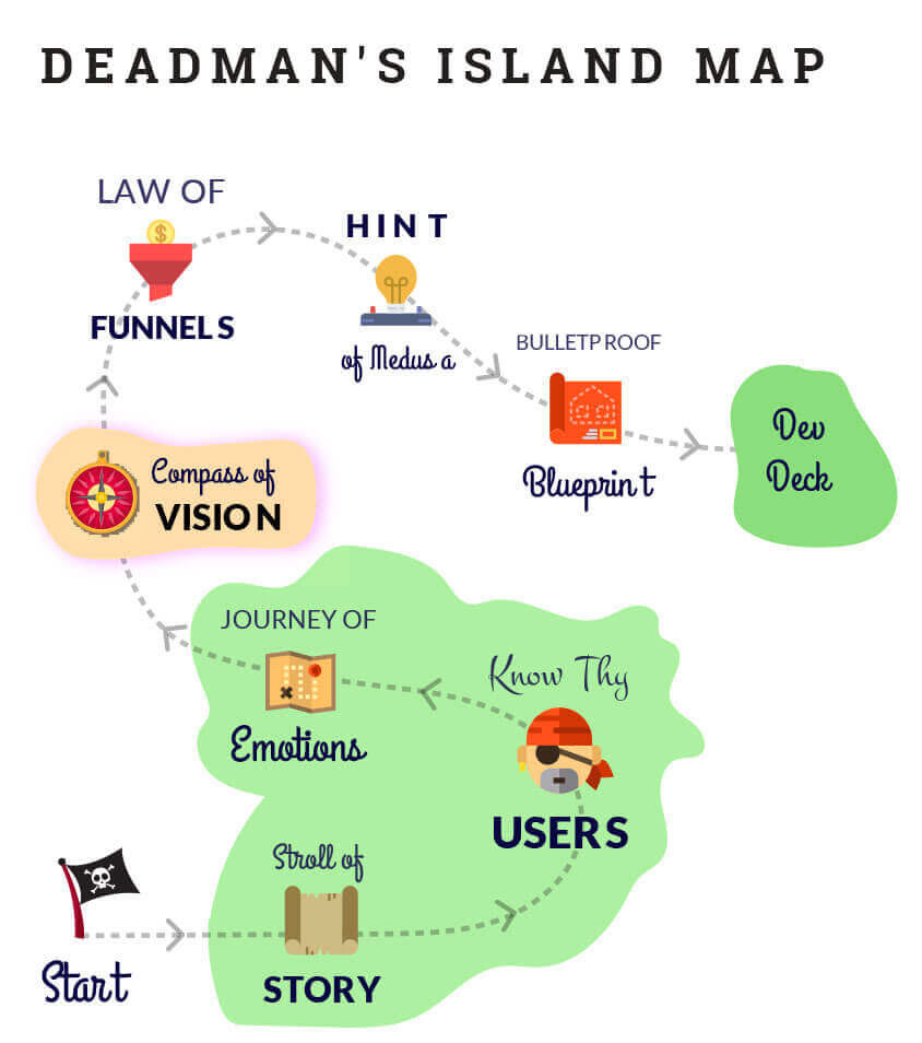
Step 0: Set the stage
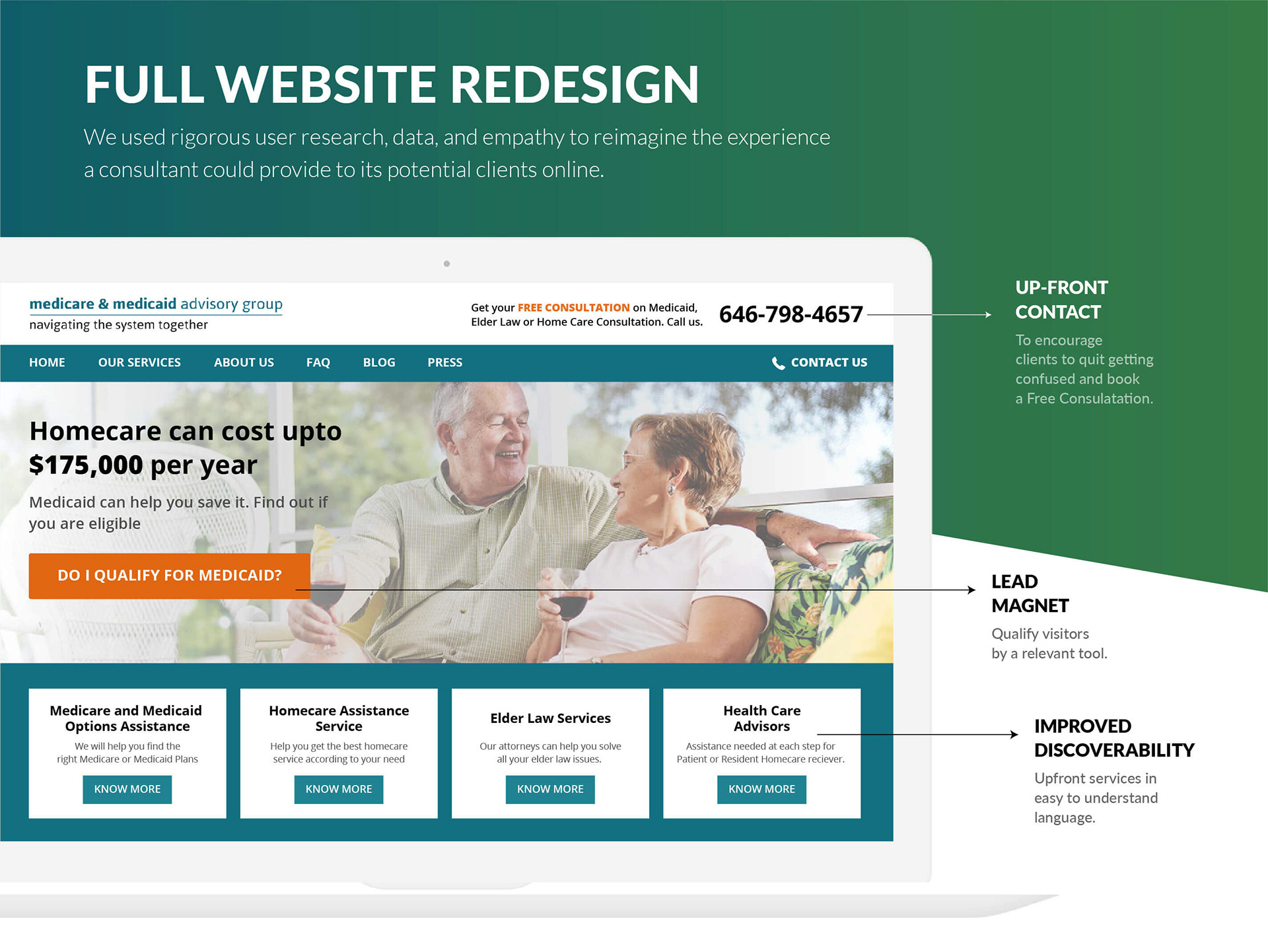
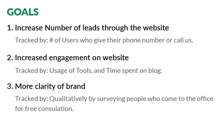
Healthcare is a very diverse industry with endless players in line to channel your potential clients to their business. We did a thorough research about the industry and found out that there was genuine lack of important palpable information online. Most websites were government owner with a very poor user experience. Other commercial websites focused more on the “close” than they did on actually helping and educating the users. We were almost sure that for a small company like MMAG, looking for organic growth, highway to success would be inbound content marketing strategy involving educating users and sharing real-life case studies/stories with them. We set certain goals for the website redesign:
Step 1: Define the Story
Users are not attracted to best products and services, but to products that they can understand the fastest. Simplicity and clarity are the key factors of a successful product. The story of your product is just a way to make your core message and premise crystal clear for you and the users. Hence we first start by defining the story for the product. It helps in making sure it has a problem-solution fit (means that your product solves a real problem that users really care about).
Step 2: Know your Users
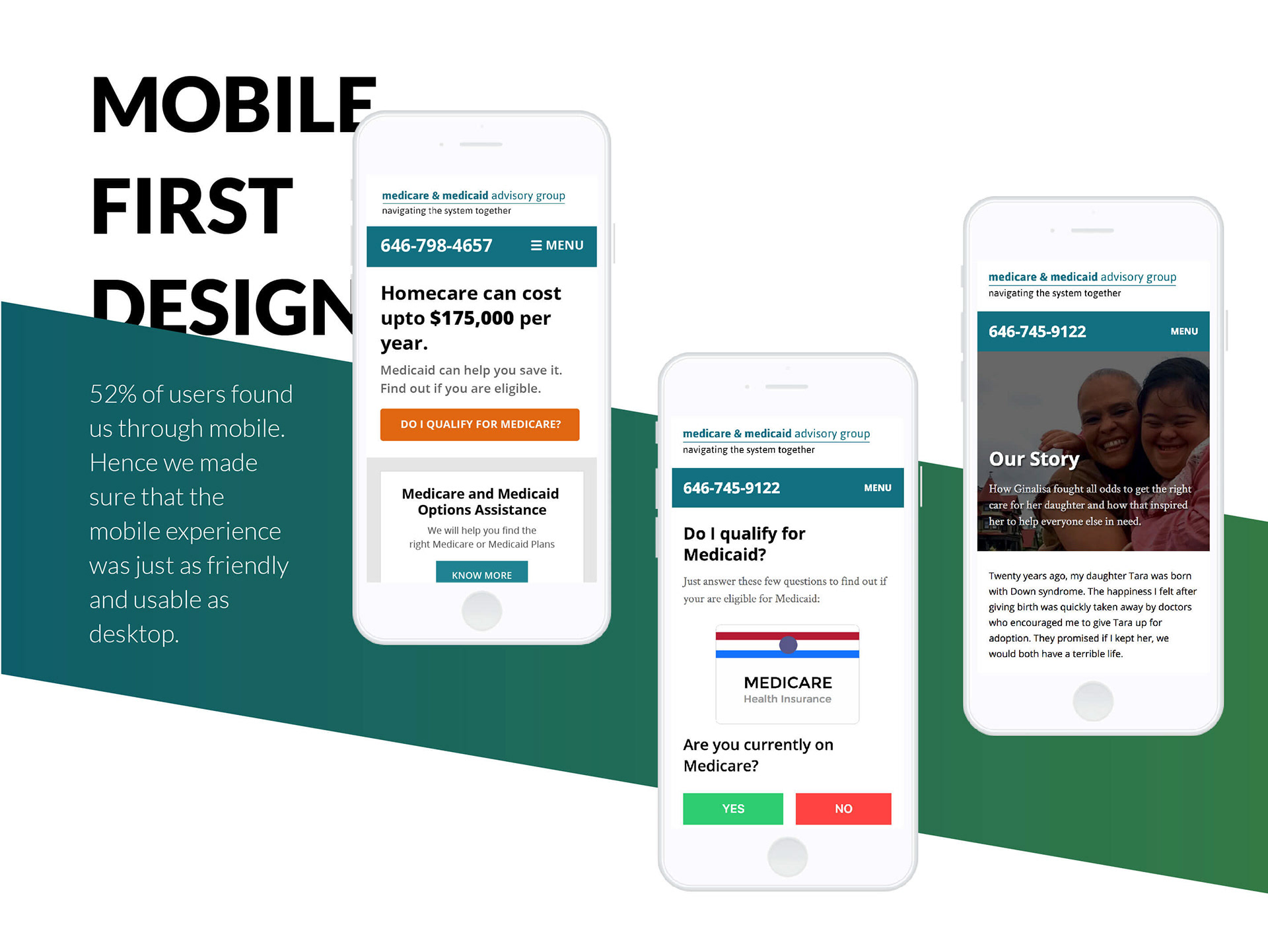
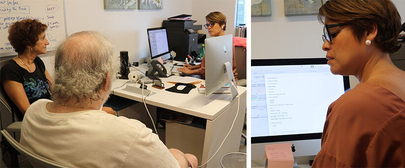
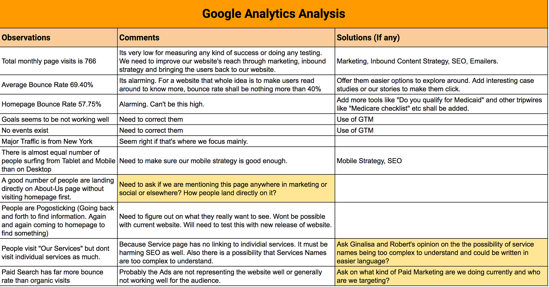
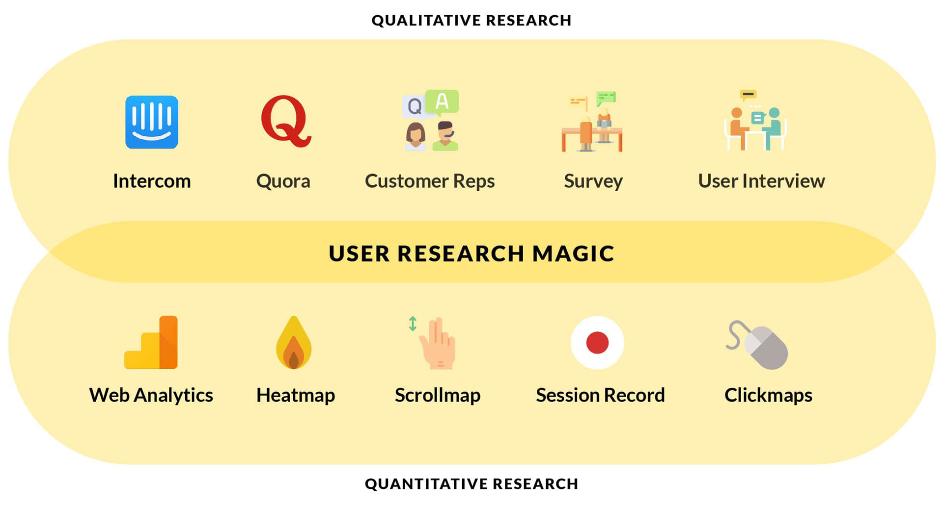
This project needed extra attention in User Research as the whole decision of someone hiring MMAG was based more on emotions and trust than anything else. We needed to figure out what users needed and then deliver it to them at the right stage of the funnel. We started with analysing the Web Analytics for their original website for cues of user behaviour patterns. We found that the website was not engaging and a tad bit confusing. Lack of intuitive options made it hard for users to find the desired information. After quantitative analysis, we turned to qualitative measures of understanding the problem. We sat in multiple free consultation meetings of potential clients to understand the kind of questions and mindset they have before taking the decision.
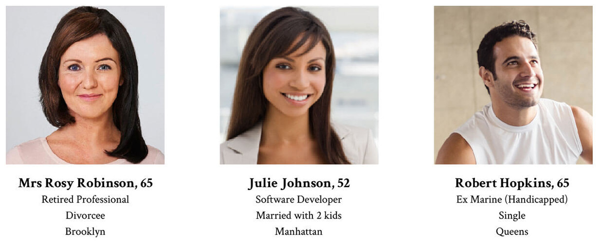
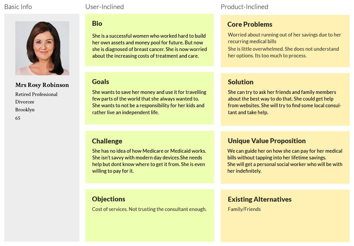
User Persona was much needed to write a compelling copy and create a robust website strategy. Based on all the research, we made 3 personas for MMAG that covered all of their ideal clients.
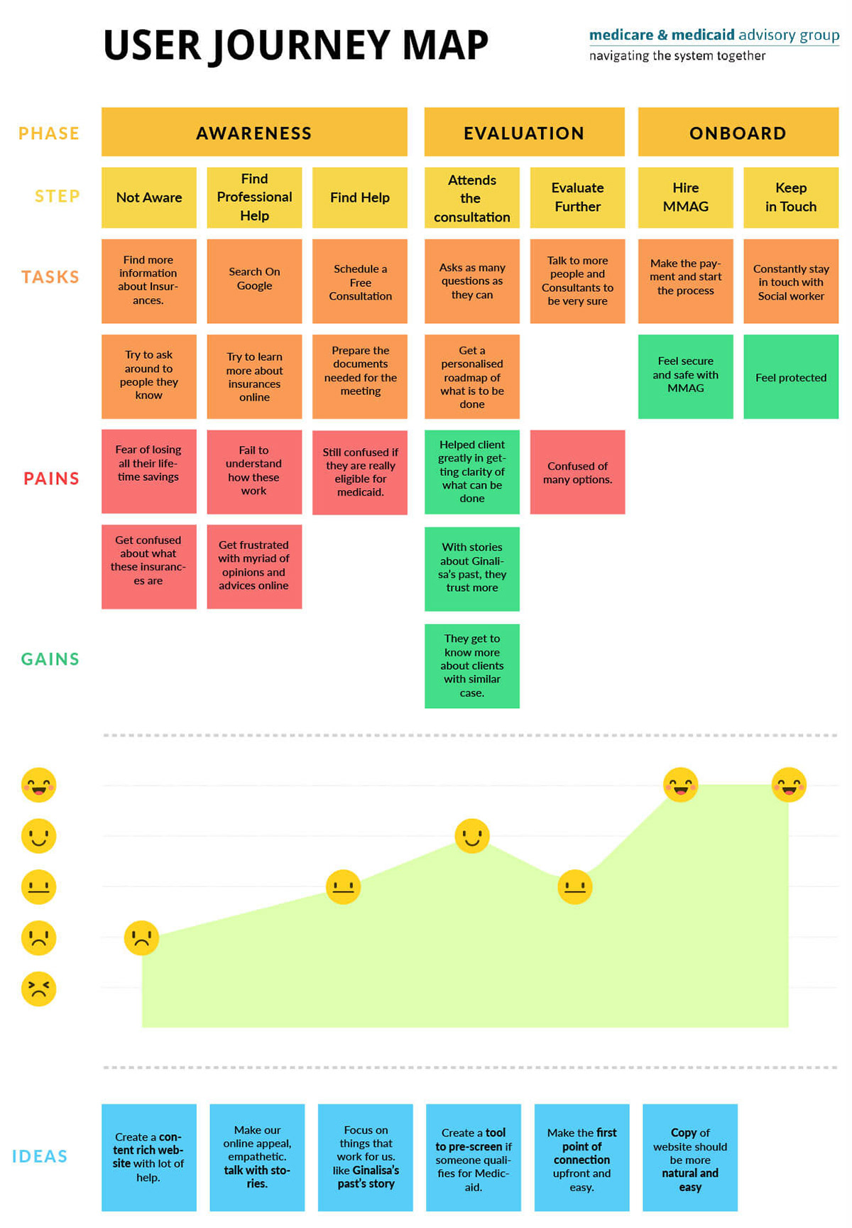
Step 3: Journey of Emotions
Till now, we had a basic idea of the user journey, i.e. steps taken by clients from start to the end. We were focusing more on cold, warm or hot leads who may visit our website. We laid down their complete aggregated journey to find patterns and ideas to improve the experience.
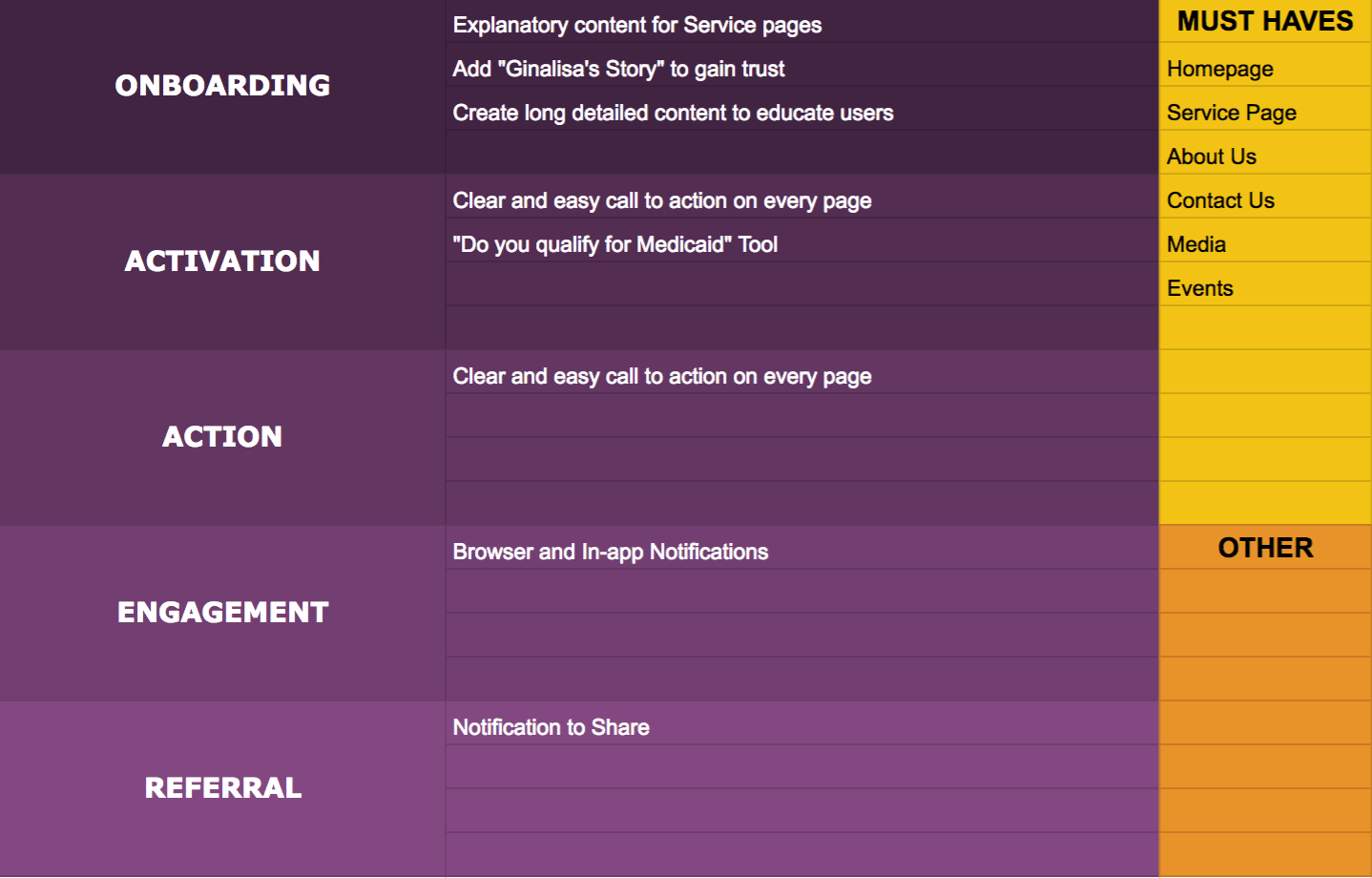
Step 4: Brainstorm and Prioritise
This the step where research is used to come up with a list of features (requirements). All the features are basically divided into 7 sections. Every app has a user that could go from Onboarding to Referral. While brainstorming, when we add the requirements (features) in following sections, it helps not miss or ignore any step in the funnel.
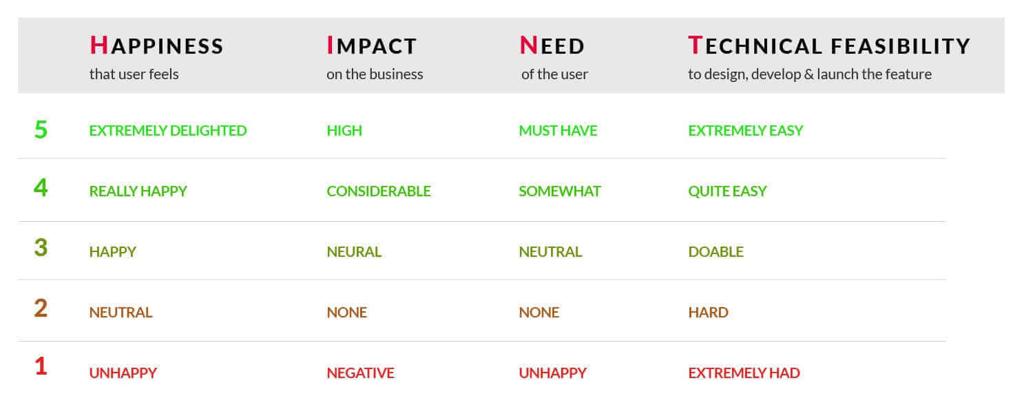
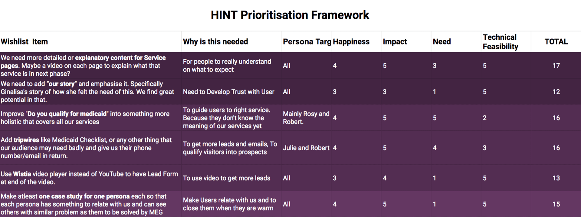
Prioritise the features with HINT Framework
Now we had a set of requirements (or features) that we thought could improve the product or help the business. Now the time was to prioritise these list of features to see where shall we put our focus the most. We used our own prioritisation framework HINT to prioritise the features.
Step 5: Prototype and Test
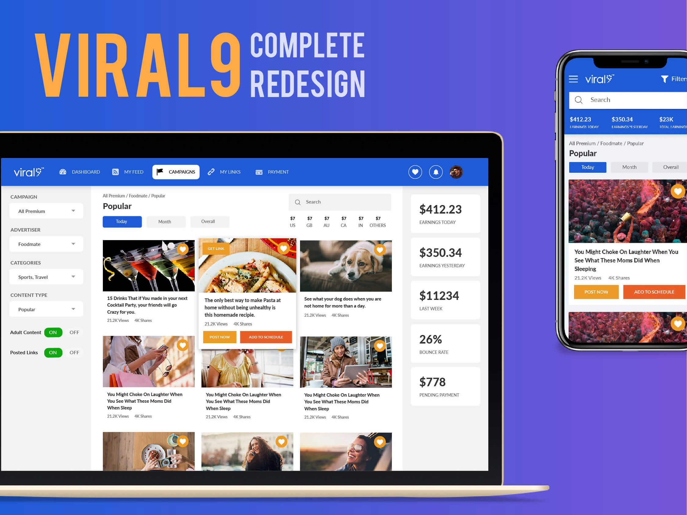
Finally, we had everything we needed to start prototyping for Viral9. We started with quick sketches of the main features of the screens individually. Then performed Zen-Voting to vote for the best ideas and structures. Then we sketched again to create a collated version of the best-voted ideas. Sketching gave us a low-fidelity to get validation from the stakeholders about the flow and the idea. This helped us gain more insights about possible ways to design. Once the basic flow and structure was decided upon, we went on to create mid fidelity designs.
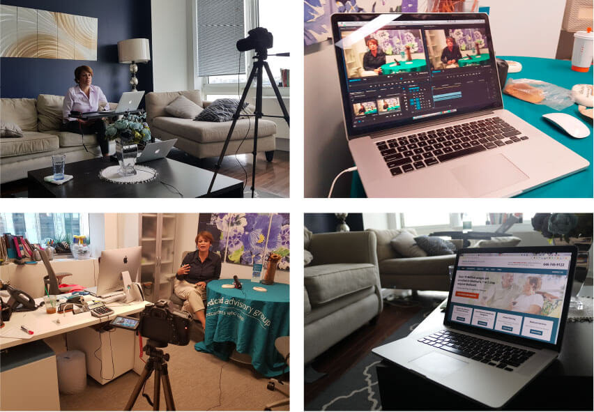
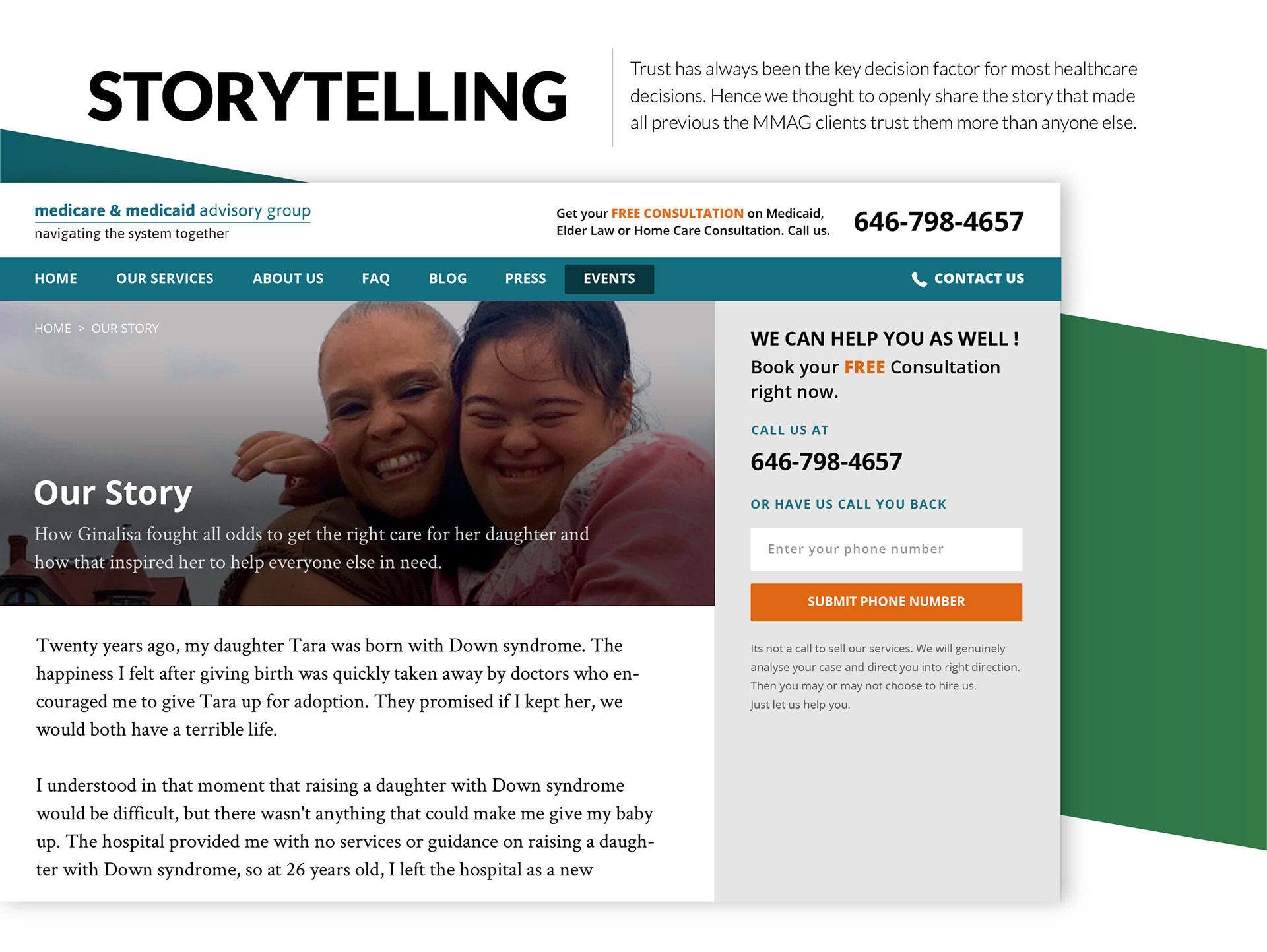
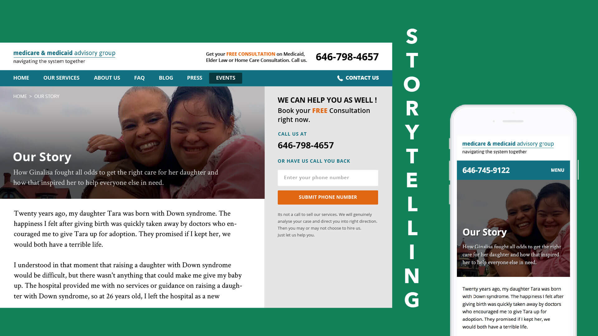
We also went a step further to help MMAG create a content-centric website by helping them create targeted video messages for Medicaid Pre-Screen Tool and other instances on the website. We knew that if they see a real human face on the website, they would trust more than just interacting with a raw text-based experience.