
01: KICKOFF
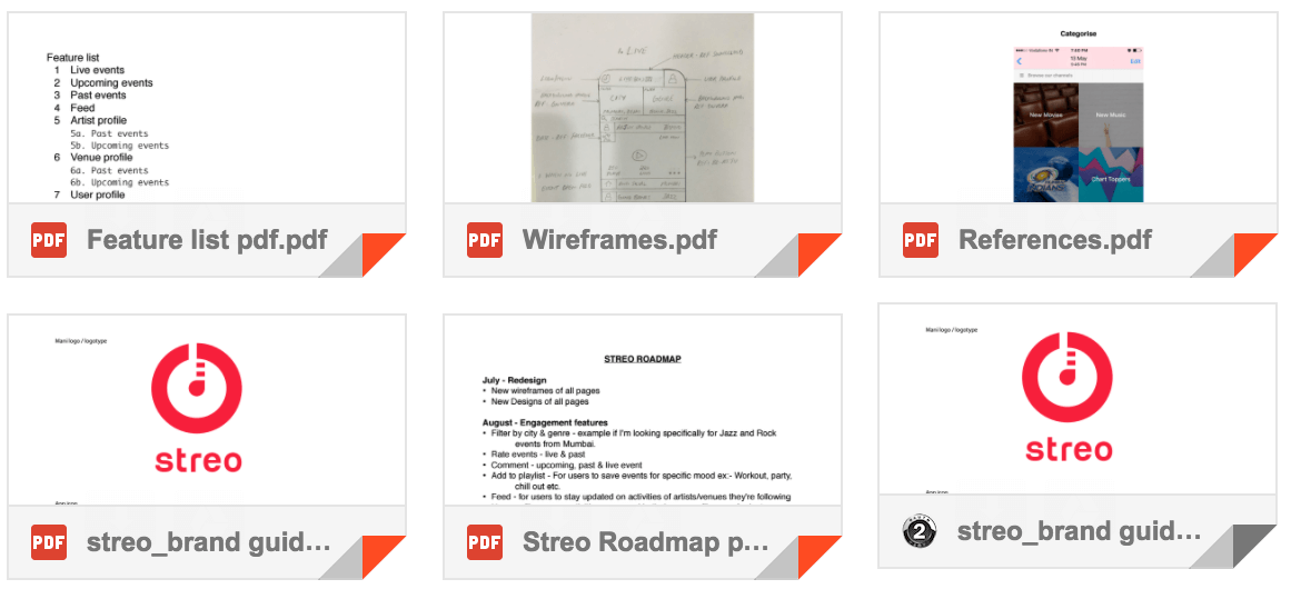
Initially we started with getting a detailed understanding of the projects, its future plans, target audience and known problems in product. We were given a standard set of files ranging from brand guidelines to few rough sketches from our enthusiastic client. It was nice to know that founders had done quite a bit of research and knew a lot of areas where there existing app was lacking. We started by evaluating the current app against the features that were asked for.
02: RESEARCH
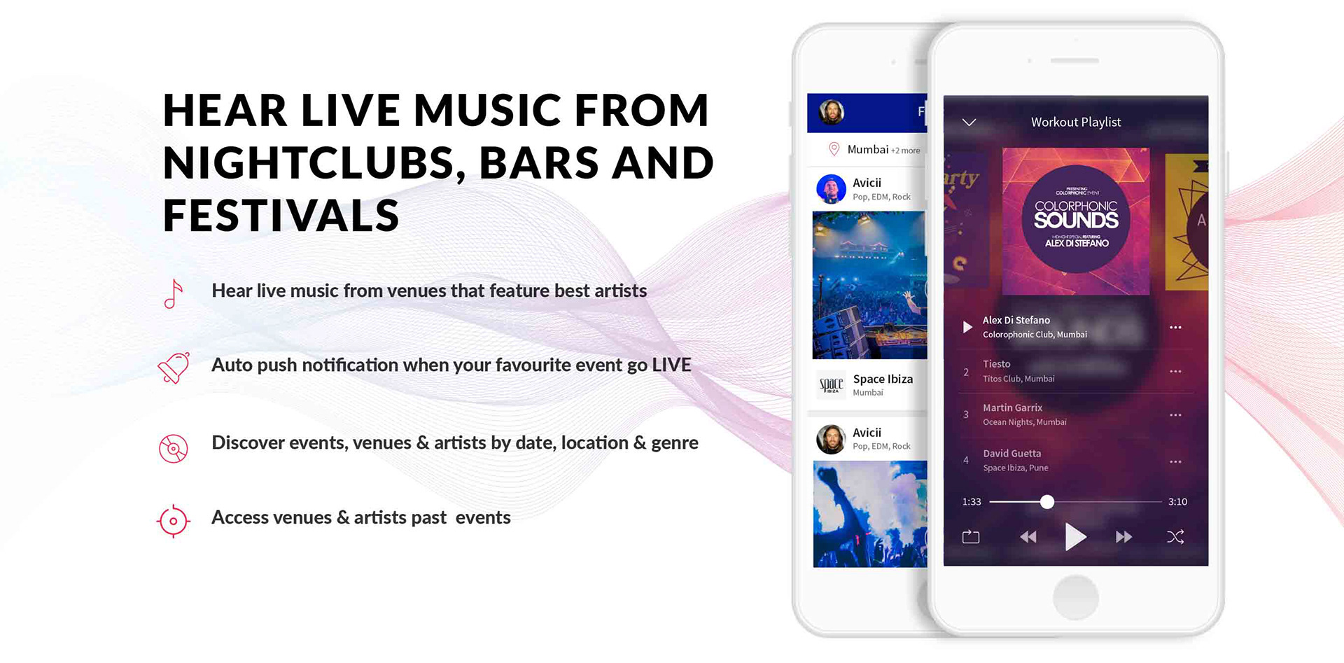
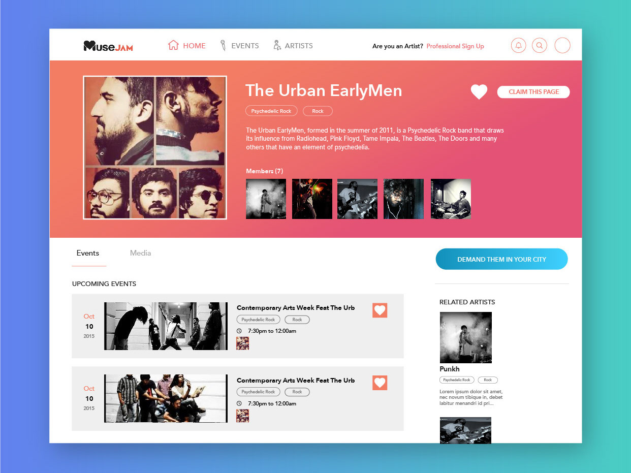
We did an extensive competitive research to understand their approach. Conducted a series of usability testing sessions to understand the user journey and expectations from a music app. One thing we came across in research was that people absolutely loved the music in Streo but they still stopped using it after a couple of days.
We dig in to find out that it was probably because there was high friction to find desired events. Also, there was no notification system built else than having to notify when an event is live, hence nothing that brings back the user once he has left the app. We created a complete user journey for Streo and its top competitors.
Then we built a screen chart for other competitors:

03: WIREFRAMING
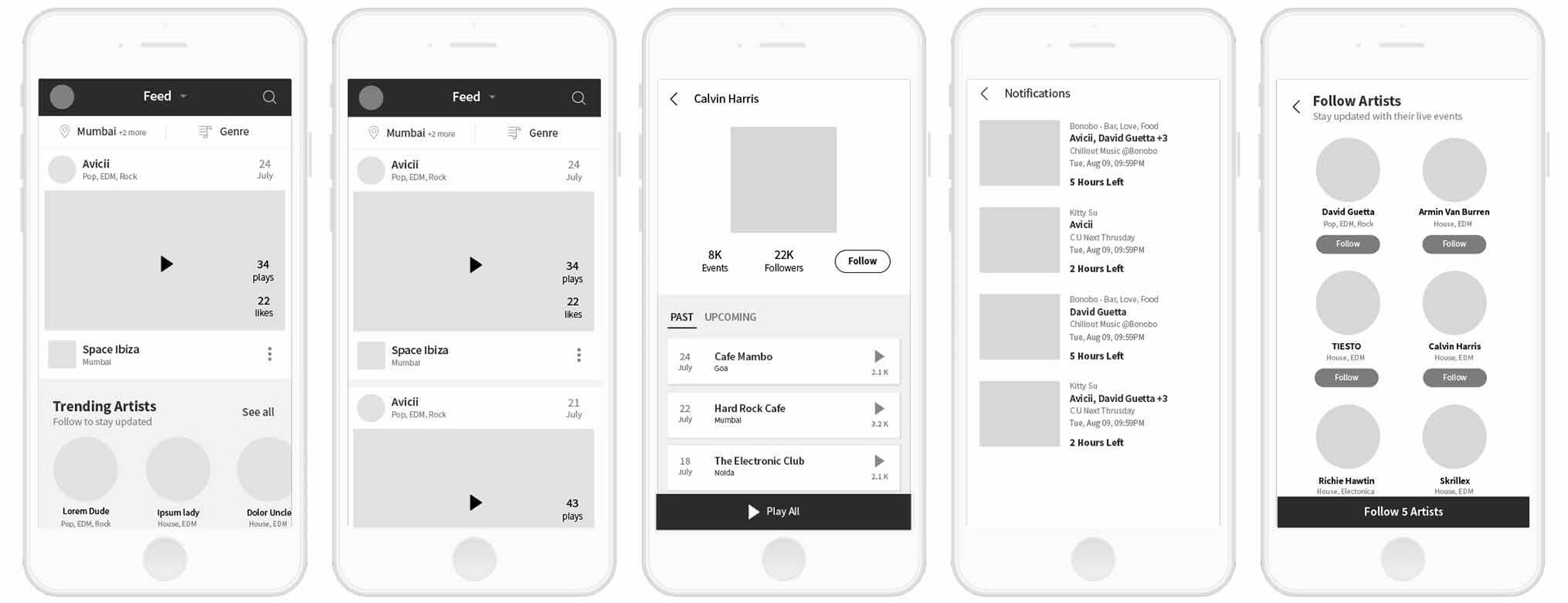
After requirements gathering and getting a basic understanding of the existing pain points of the app, we jumped in sketcking our first set of ideas. A lot of new ideas and ways to solve the previously learnt problems came in this stage.
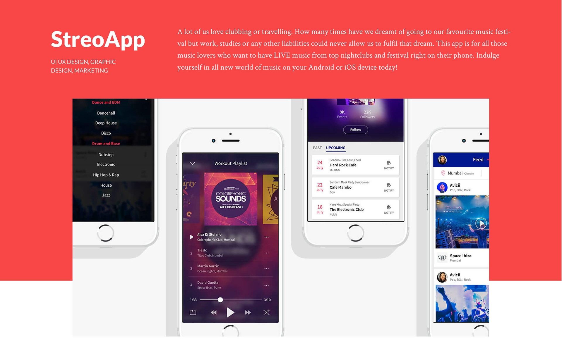
We introduced new features like:
1. Engaging onboarding to provide better experience to users.
2. Playlists to organise music.
3. Profile for User, Venue and Artists.
4. Much needed Search option.
5. Filter by city and genre.
After sketching, and multiple iterations with Mr. Aarush, we settled on few sets of sketches and went ahead to make a mid-fidelity of the sketches to convery the idea in a better way and see things in action with a clickable mockup.
04: DESIGN
Once we were satisfied with the prototype, we gave it to few people and saw our beloved prototype in their hands. Out in the wilds.
A lot of things went much better than initial usability testing of actual application. We noted down the points where we had to rework and started with the High-Fidelity prototype instead of going back again with the Mid-Fidelity.
We stuck to the brand guidelines given to us and our aim was to make the app stand out the the target customer which was 16-35 year old music and party lovers.
Most of these people use apps everyday and are quite aware of good standards of designs. Or at least, they sure judge an app on how it looks and feels. We wanted to make an app that was a breeze to use, had a minimal feel to it so as to allow the content to bring the color in.